Blue Box
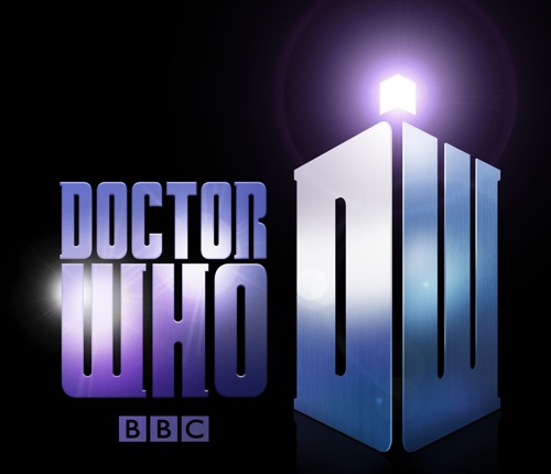
The 2010 Doctor Who logo has been announced.

The answers to my questions turn out to be “Above”, “No”, “Serif”, “Neither” and “the coloured lights are inside it”. It hearkens back strongly to the older, simpler logos, which is nice. I see everyone at the BBC still gets excited by lens flares. I’m reasonably keen, though I’m curious to find out when they use the initials and when they use the full word. It’s certainly a nicer logo for putting on DVD spines which is obviously my main concern.
Hrmmm.
There’s not actually very much to say about a new logo. I should have covered the Apple event instead. They’re much more contentious. I went onto a Who forum to try to find crazy fans whinging that the new logo doesn’t do target disk mode, but no such luck.
137
Andrew Telley
October 6th, 2009 at 9:40 pm
Dear Tom,
As a long time reader, first time comment leaver, may I firstly thank you for keeping us all up to date on the subtle happenings in the world of The Doctor.
May I ask that, as a relatively new initiate to the series, that you provide a brief recap of logos past, so that we can compare and accurately assess this current incarnation in light of its predecessors? Perhaps a “This is Your Logo” series? From what I’ve seen, that one from the 80’s can only be described as spunky.
Thank you,
Telley (I’m aware there are other Andrews that roam these halls)